A Peek into the Artistic Process of a Curious Creatures’s Beer Label
It would be fair to say that art is one of the core tenets here at Curious Creatures.
Above all else we care exponentially about everything that we do, whether that comes in the form of the products themselves or the environmental impact of what we produce.
Parade of the Western Winds (West Coast IPA) - Illustrated by Tatiana Isabella
For me personally, Curious Creatures is an exploration of visual storytelling. As the illustrator behind each beer label, I pose the start of each one as an excuse to ask a question, what is this character doing? It would be simple to merely draw a label with some absurd thing happening and not questioning the wherewithal or why, but having guidelines and rules for myself is important to making something that consistently works within our branding.
To those of you who are unaware, Curious Creatures is far beyond just a brewery to us. Our mascot Alfred exists within his own world with his own trials and tribulations. He has two brothers, (one of which you have seen already on our first beer, Monch) and a nephew. Alfred is a travelling salesmans with a complicated personal life, and a far more complicated wider world. He befriends strangers on the road with the ultimate goal of trying to convince these creatures with their curious skill sets to help him rectify what is wrong in his life. Alfred is seemingly self-centred, but he also cares exponentially for those around him who have taken the time to support him. This character exists as the slightly comedic backbone of our company, but also in a grander sense, the embodiment of our desire to exist differently within this realm of corporate standardization.
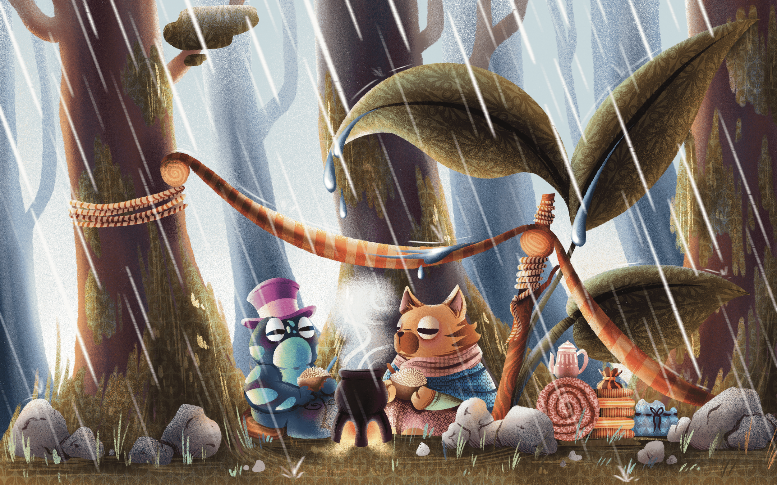
Alfred and a befriended critter, sheltering from the rain while eating rice in Kome Forest (Strata Fresh Hop Rice Lager) - Illustrated by Tatiana Isabella
Consequently I spend a lot of time thinking about the story I am telling via these beer labels. It is my favourite part of this work, thinking about who these characters are and the motives behind the actions they are taking. I could probably spend a ridiculous amount of time nattering on about this world and its strange cast of characters, but for now I want to focus more on the process of going from point a to point b, an idea to a finalized label.
The first part is always to talk to our brewer Sebastian to see what he’s making. There have been instances where I have done beer labels based entirely off of my own desire to draw something within the world, but generally speaking I try to start with an understanding of what the brewers expectations are for this beer's packaging. As the artist, I always have the final say, but starting from a place of mutual understanding is good.
We usually discuss the colour palette, and what characters we want to highlight with this beer. And from there I begin sketching. My sketching process varies from each drawing to the next, but generally I always start from one of two places, shape or text.
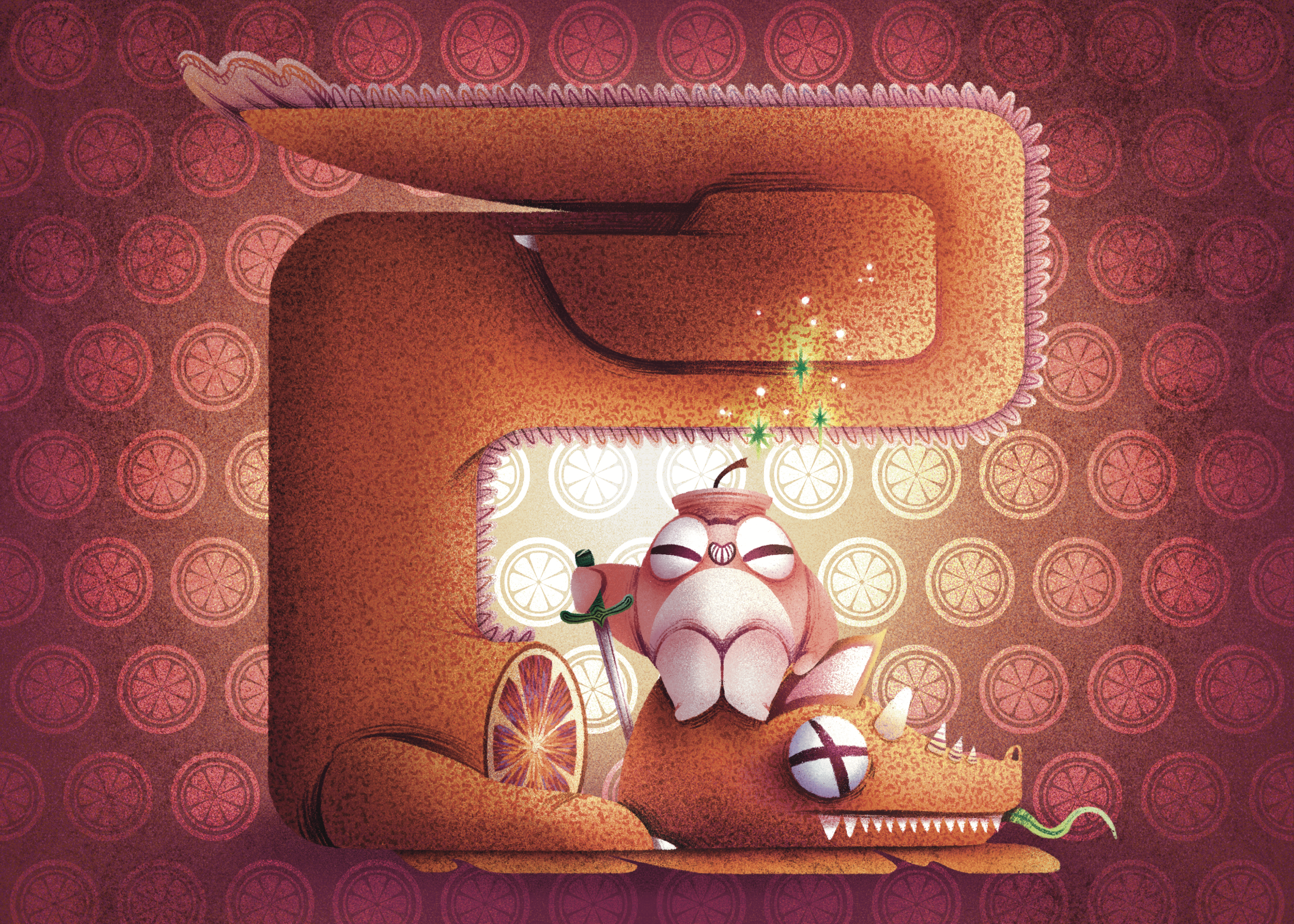
Missile and the Bloody Orange (Salted Blood Orange Sour) - Illustrated by Tatiana Isabella
When starting with shape, it just means that the primary overall shape of the illustration is the base from which I decide what I want to illustrate. You can see this within Missile and the Bloody Orange, and Spires of the Sunken Tomb. I blot out the general flow and motion within the composition that way I know where I need to place every little detail to draw a customer's eye throughout.
Spires of the Sunken Tomb (Hazy Double IPA) - Illustrated by Tatiana Isabella
When I start with text, this just means that I am writing out my internal monologue. I find it easier to compute my thoughts on my own work if I have a physical base of what that train of thought looks like. Sometimes this means dragging out my massive seven pound sketchbook (Which I just went and weighed on my scale, so this is accurate) and scribbling for pages on end, and sometimes I fill up pages on my ipad with little thoughts and details. It varies from case to case, but for me this is one of the clearer ways to process my thoughts.
Example of Beyond the Mirage (West Coast Pale Ale) sketches.
From here I go to rough thumbnails to give a quick overall encapsulation of what needs to be depicted. This part is incredibly important when it comes to the overall appearance of the beer label. Because of the cylindrical element of the can you have to make sure that each design uses that shape wisely, while also taking into account tapering at the top and bottom of it. We can’t have information that is important to the narrative being told on each beer label in these contorted areas. So composition becomes all the more important during this drafting stage when taking into consideration that the final product will not be flat like the current sketches.
Example of Odyssey (Fresh Hop Pale Ale) thumbnails.
After I have something that I broadly like, I go looking for my references. I find that having other artists work whose overall vibe seems to match the essence of what you are trying to do is incredibly helpful to honing in on what elements you are trying to highlight from piece to piece. And it’s important to note that research and references are distinctly different from just directly copying something, which always should be avoided. Many of my reference boards are just filled with images that I would not be able to take myself, or anatomical depictions that are important for accuracy. Research should be just as principal in the artistic process as sketching, and in many ways it is that early research that will affect the final overall appearance of the piece. For example, my reference board for Parade of the Western Winds is filled to the brim with images of Cedar Waxwings, which is the bird that Alfred is riding on that beer label.
References for Parade of the Western Wind (West Coast IPA)
Conversely, the board I created for Missile and the Bloody Orange is just my own reference sketches for the character of Missile, and a whole bunch of zoomed-in images of bloody oranges. Reference boards suit different purposes, but it’s my personal opinion that if you don’t take that time to do that research then you are doing your art a disservice.
References for Missile and the Bloody Orange (Salted Blood Orange Sour)
When all of this work is done, I pick my favourite shade of pink, and paint defining lines and colours that would be included within the final piece. For me this part is the simplest, and I usually just go with the flow and illustrate detailed full-colour drafts. Then I offer up these samples on little platters to the rest of the Curious Creatures team and more or less tell them to pick their favourite.
Full-Colour Draft for Jungle of the Unknown Gods (Fresh Hop Hazy IPA)
Full-Colour Draft for Odyssey (Fresh Hop Pale Ale)
The greatest challenge for me personally is that, within the Curious Creatures team, we lack the ability to have large scale critiques of the work being done. Because we are such a small company, everyone has to feel confident enough in their own area of expertise in order to produce any of our products. I tragically can’t ask our brewer what he thinks about the general composition of the work I produce, just like he really shouldn’t expect me to give commentary on the flavour profile of each beer. Thus, the importance of self reliance is never better stated then in trying to dissect each composition myself with new eyes. I frequently rely on friends to have them give their thoughts on what should be corrected from piece to piece.
Once there is a consensus on what needs to change and which draft is preferred, I move on to rapidly finalizing each label. I draw them larger than is necessary for the final iteration so that Brigitta, our graphic designer, has room to resize and crop them on each can.
Guidelines provided by Tatiana for cropping Missile and the Bloody Orange
This entire process can take anywhere from two weeks to two days in the most extreme situations (The two week timeline is preferable though). After all my work is done, I pass it onto Brigitta to layout and mock-up the 3D can visualization and then, I restart the entire process with a new beer label.
If you ever want to see more of the behind the scenes on the Curious Creatures branding, I’m hoping to go in depth on each individual label in the future. And if you ever have any questions, don’t hesitate to send us an email. Alfred is always ready to send you a mildly sarcastic reply.
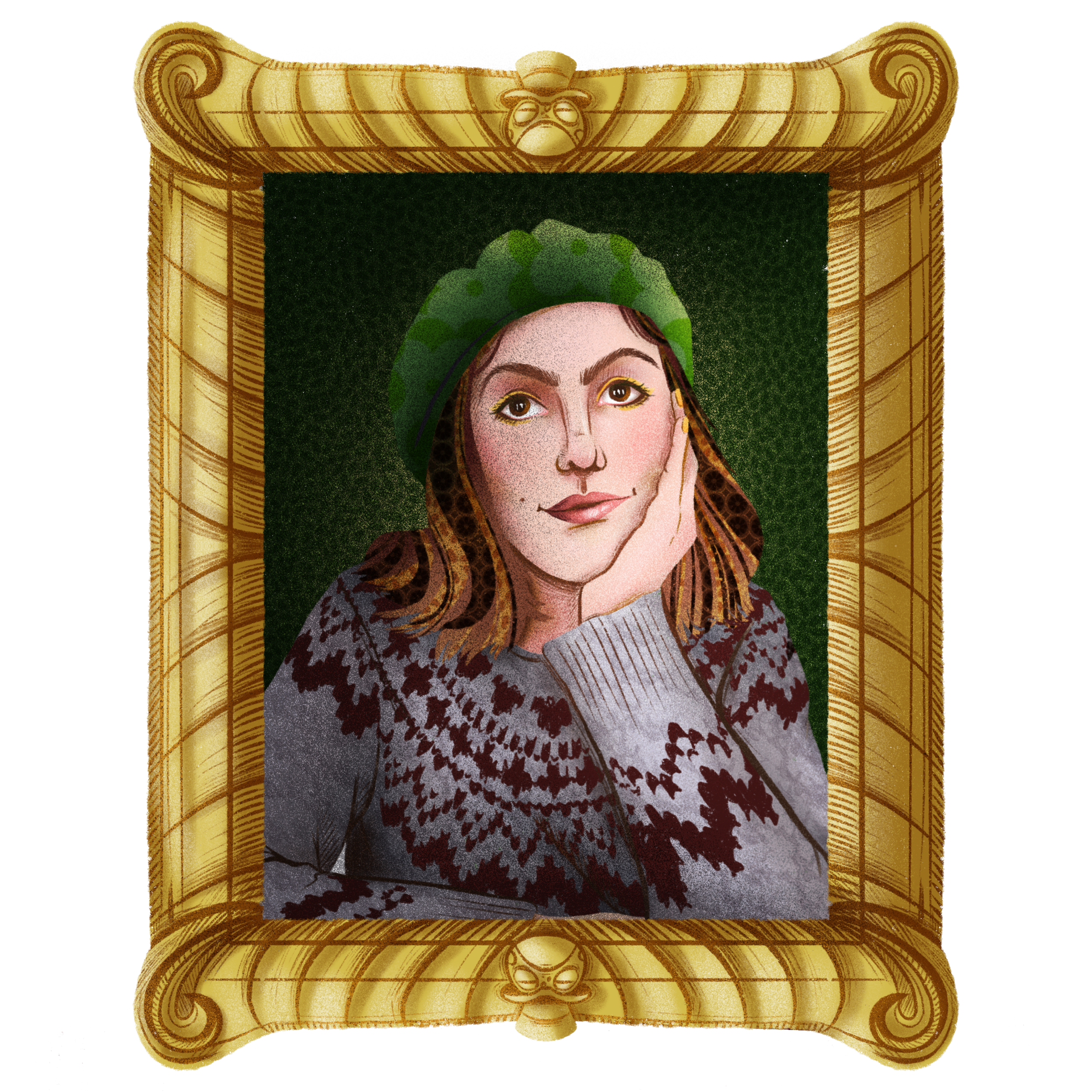
Tatiana
Curious Brand Manager and Illustrator


